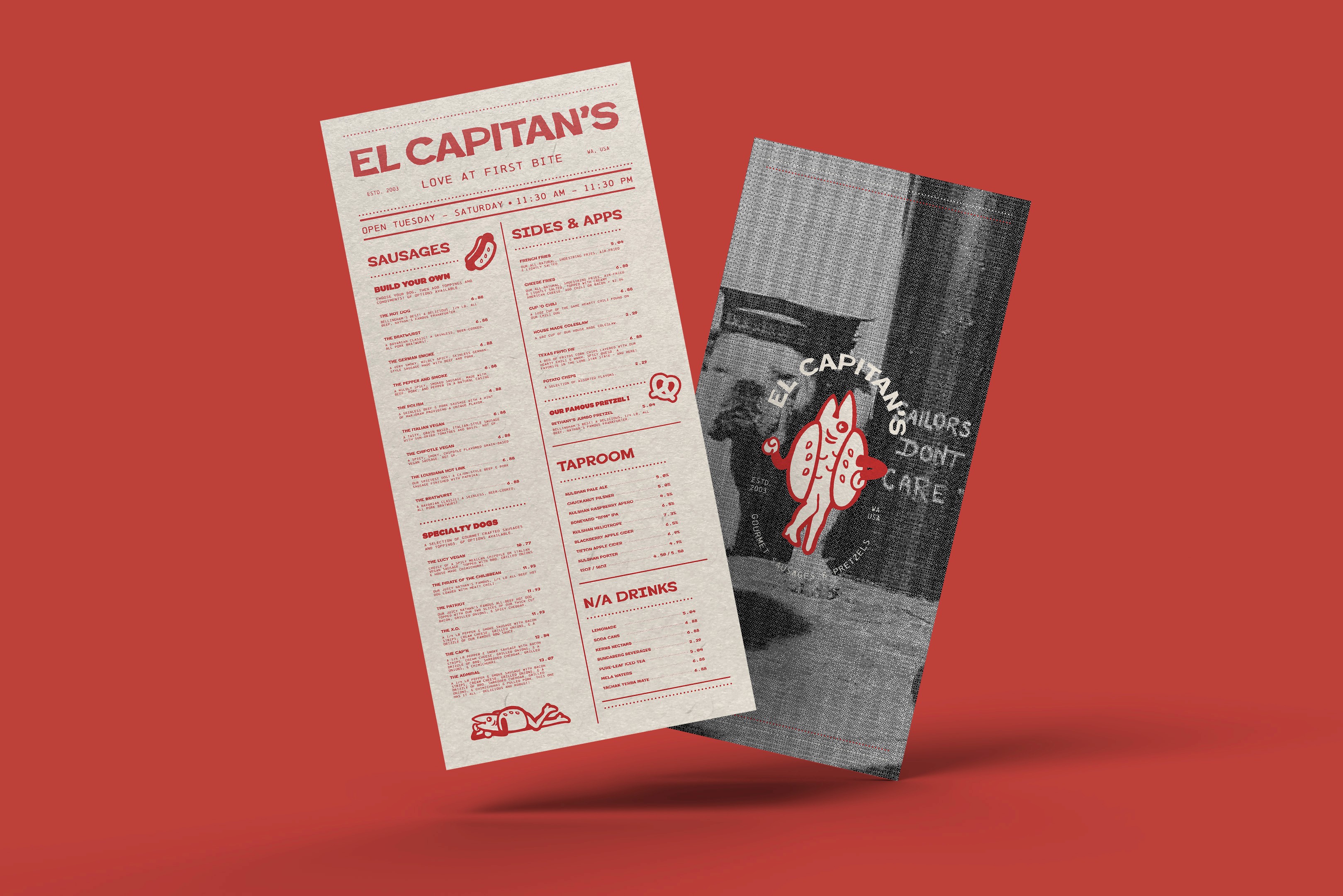
In winter of 2025, I was tasked with rebranding a PNW local establishment. As a lover of all things nautical, I immediately knew I would be doing El Capitan's.
They're a staple for late night eats in Bellingham. College students, families and tourists alike all stop by to try their notorious dogs. I felt inspired by the seafaring theme already present in their previous branding, and decided to explore beyond the rigidity of piracy. For this project, I took inspiration from vintage sailor photography, folklore and themes of romance, because who doesn't fall in love with El Capitan's once they've tried it?


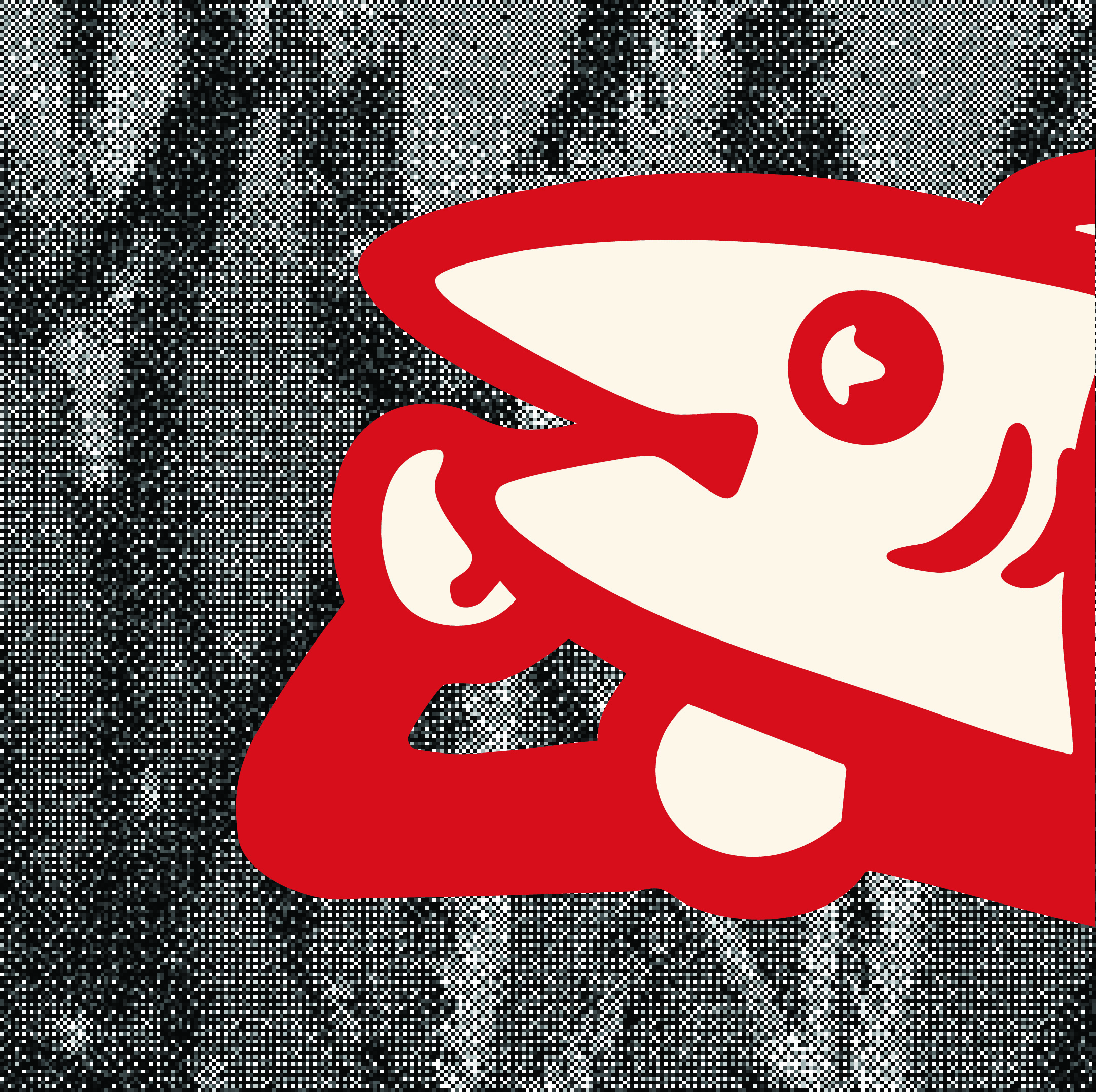
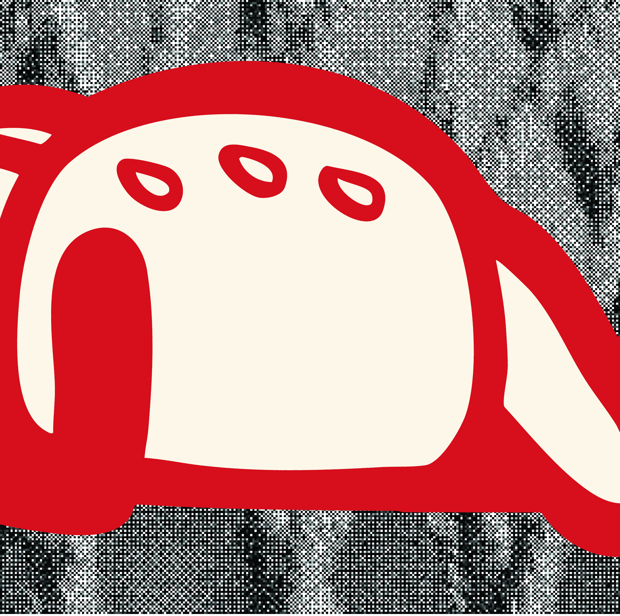
When working on this brand, I felt that a mascot would help to create an anchor for all other assets to grow upon. My brainstorming process included many a pirate, sailor and sea creature, but ultimately I struck gold with Betty Bubbles, who can only be described as a reverse mermaid.
Since mermaids are typically known to seduce sailors, it felt like an excellent opportunity to play with flirtation and romance as a central voice for the brand while remaining comedic and lighthearted given Betty's appearance.


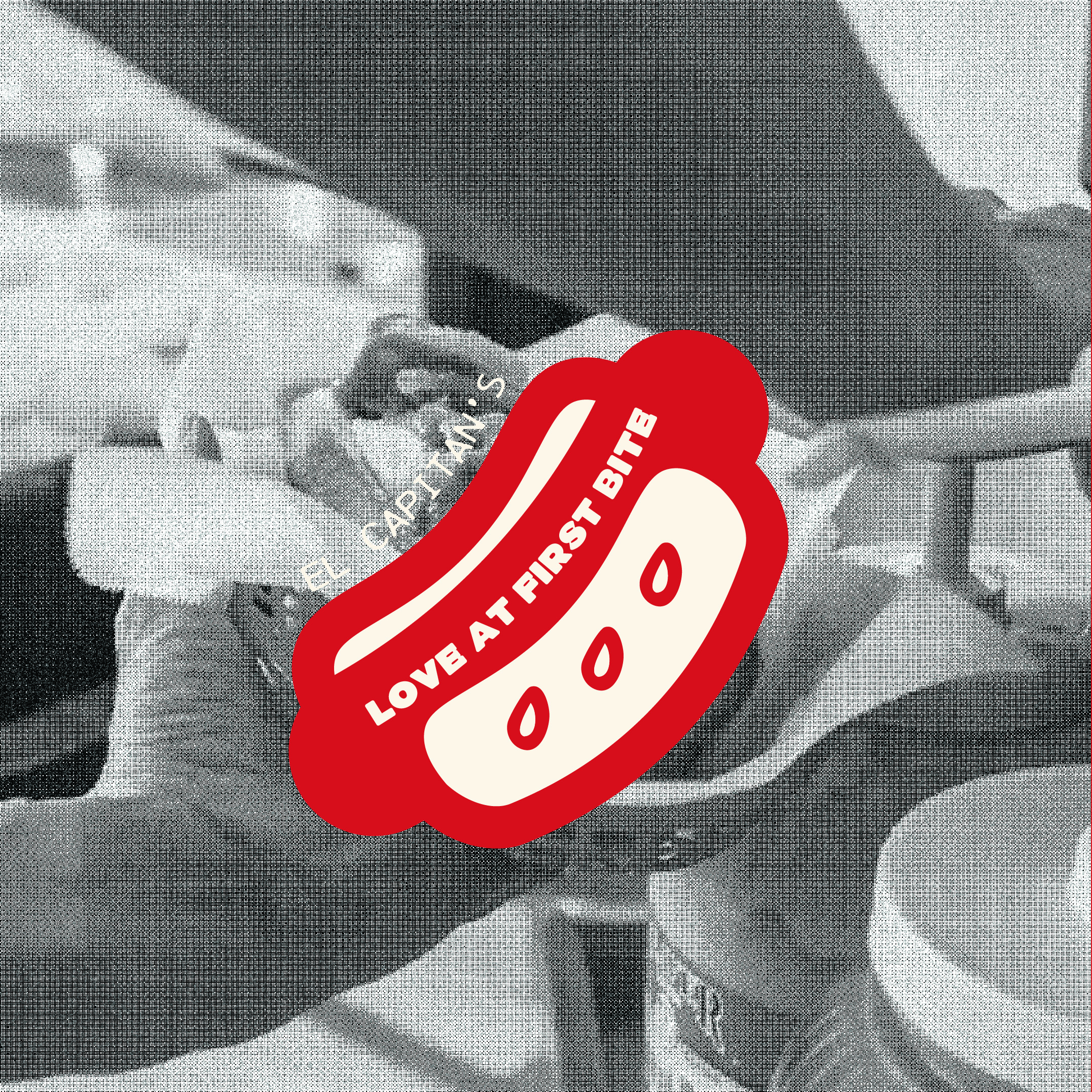
Visually, I was inspired by retro-modern illustration. It felt fitting to take inspiration from the bold simplicity of illustration from the 40's and 50's. I scoured the web for modern retellings of this style, hoping to create something that felt like just the right pairing of outdated and relevant.
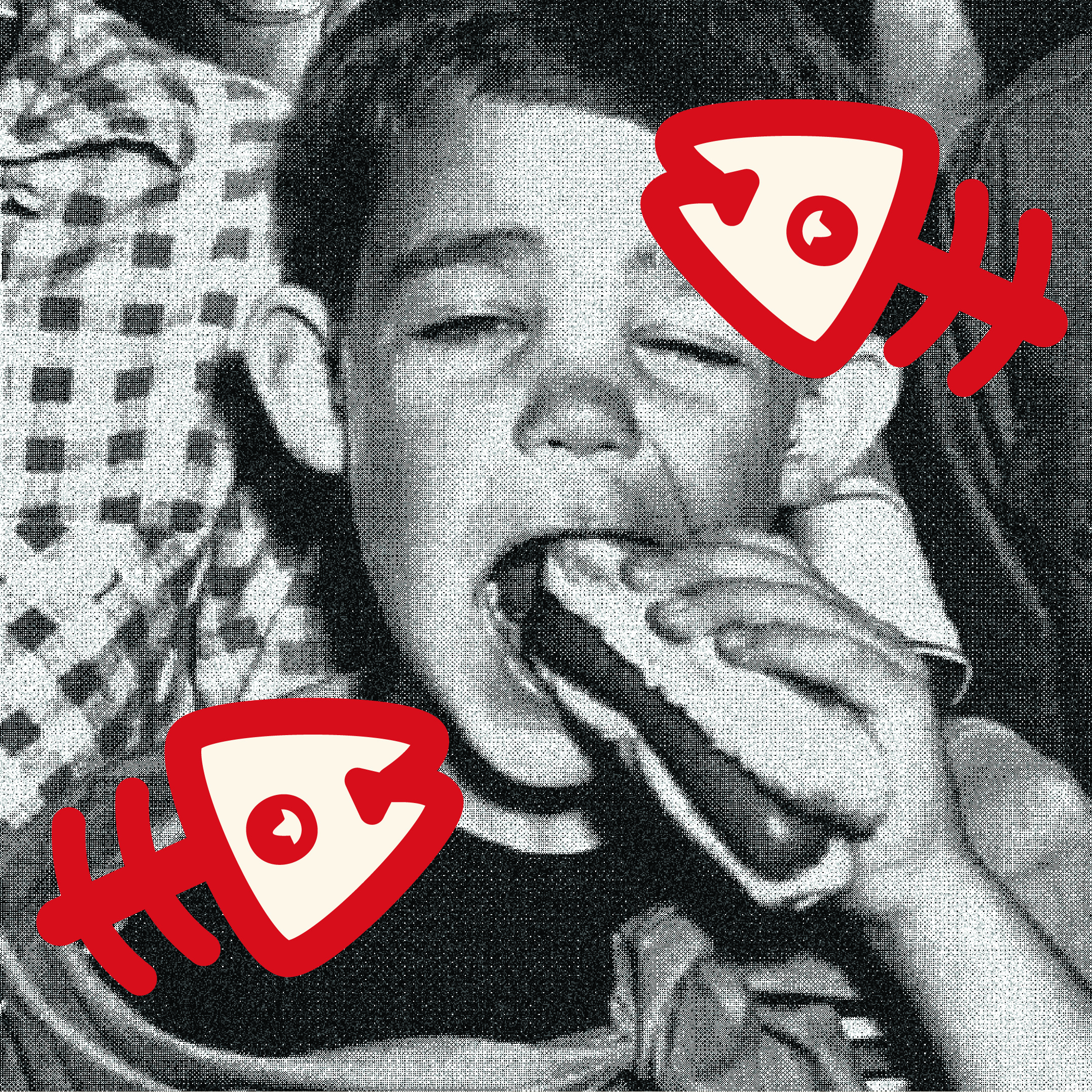
Using this fun style for graphic elements as a base, I opted for vintage B&W photos with a gritty, nautical texture for contrast.
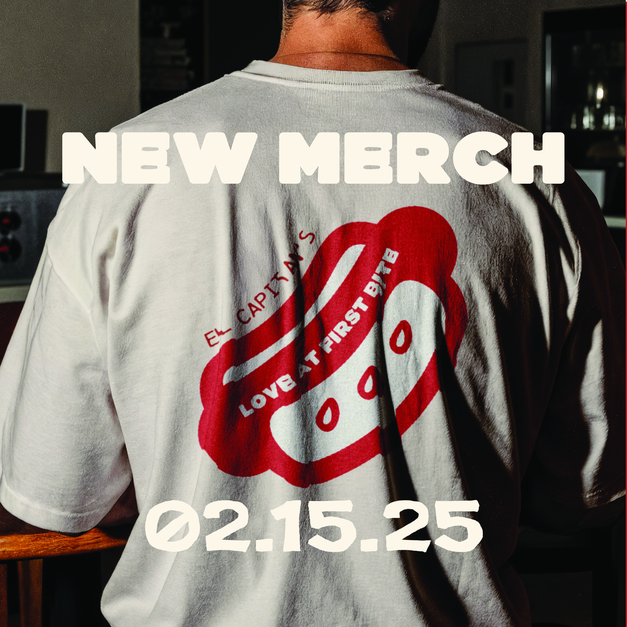
Typography followed a similar path. I wanted to create a system that felt relevant for modern design and consumers, but could still feel retro when given the proper treatment.