Commercial farming is a prevalent issue in today's world. Biodiversity is harmed, native flora and fauna dwindle, and unethical business practices are reinforced. In a world full of these shortcomings, how can we work to build a better future?
In spring of 2026, me and three of my peers asked the same question. We wanted to bring attention to the world of regenerative farming and the good that communities can accomplish when they work together. From this mission, we created Hucklebee, a local farmer's co-operative focused on reshaping our idea of agriculture.


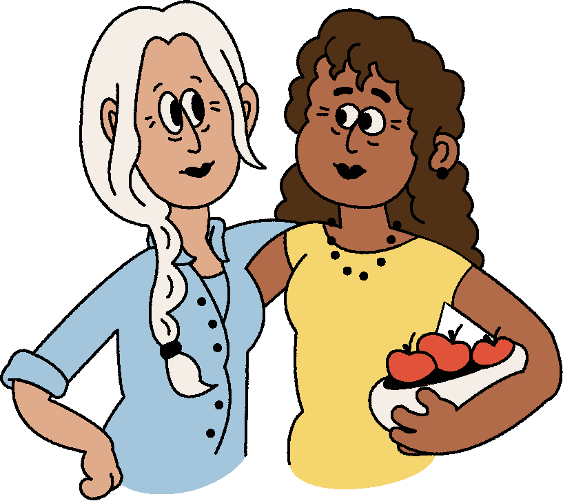
Darla and Gail met in 1978 and built a life grounded in connection, hard work, and care for the land. Along the way a rescued goose became a small but meaningful part of their story. In 2005, they transformed their family farm into a worker-owned cooperative, growing it into a thriving, community-driven place rooted in shared purpose.
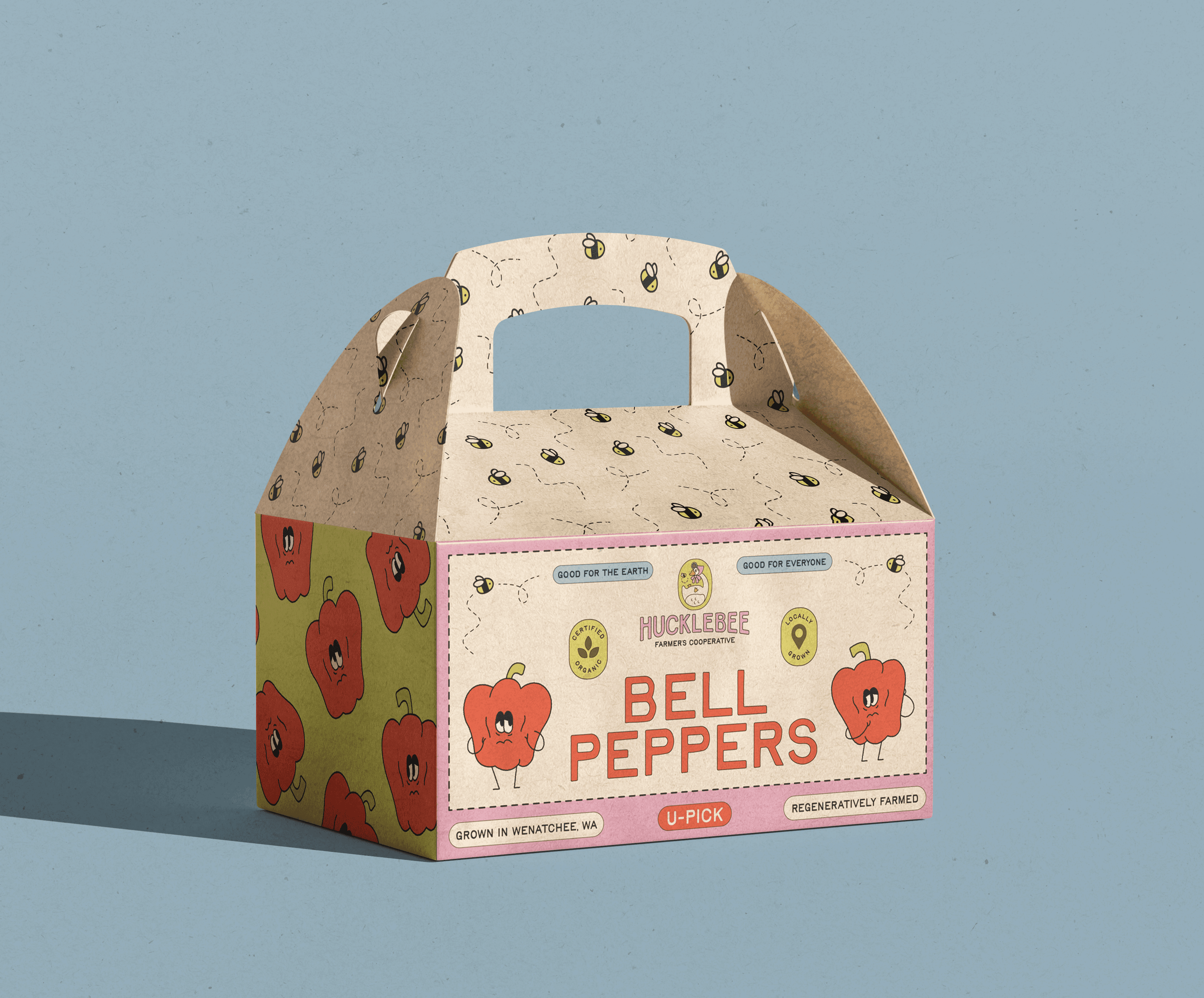
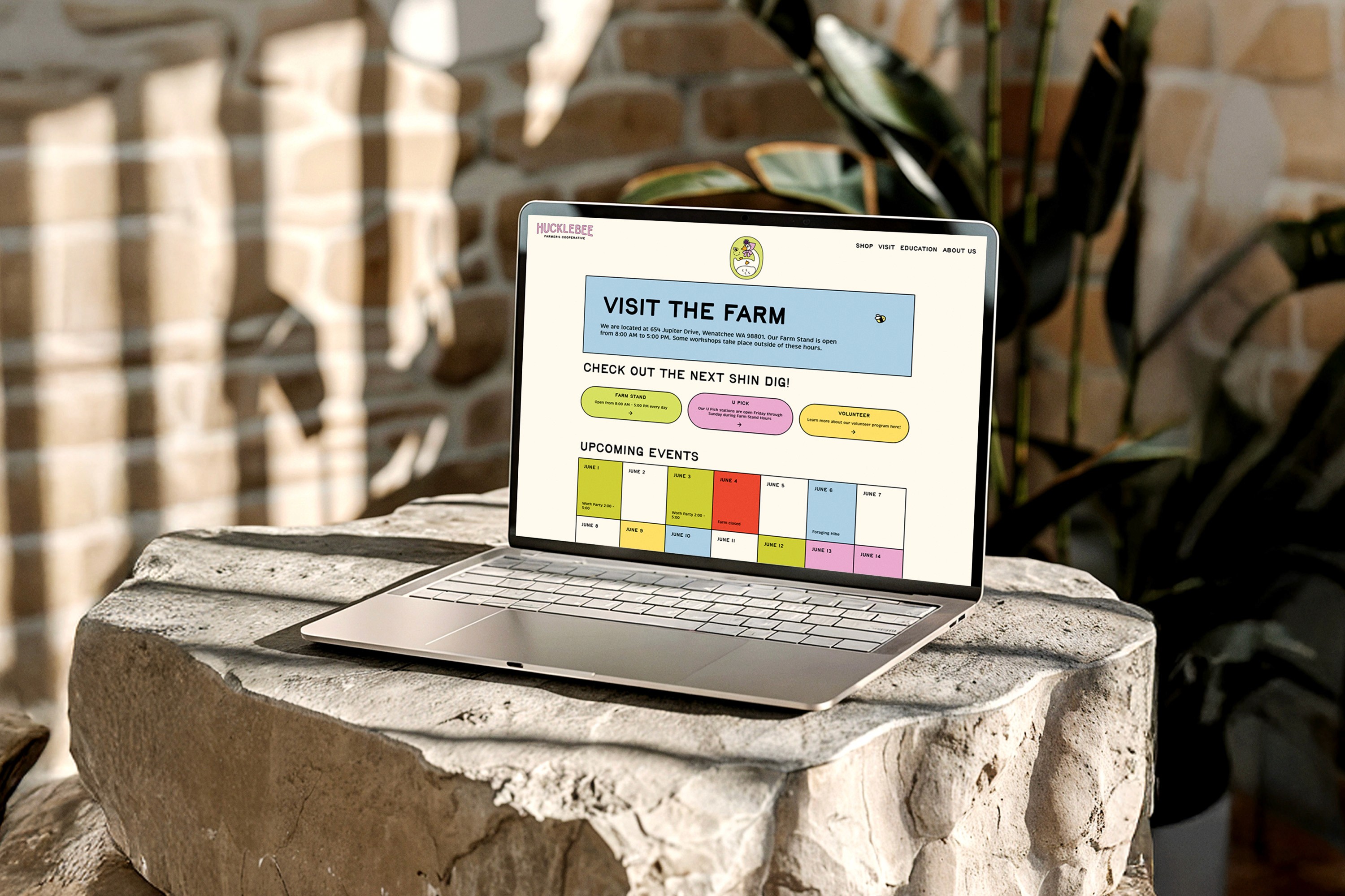
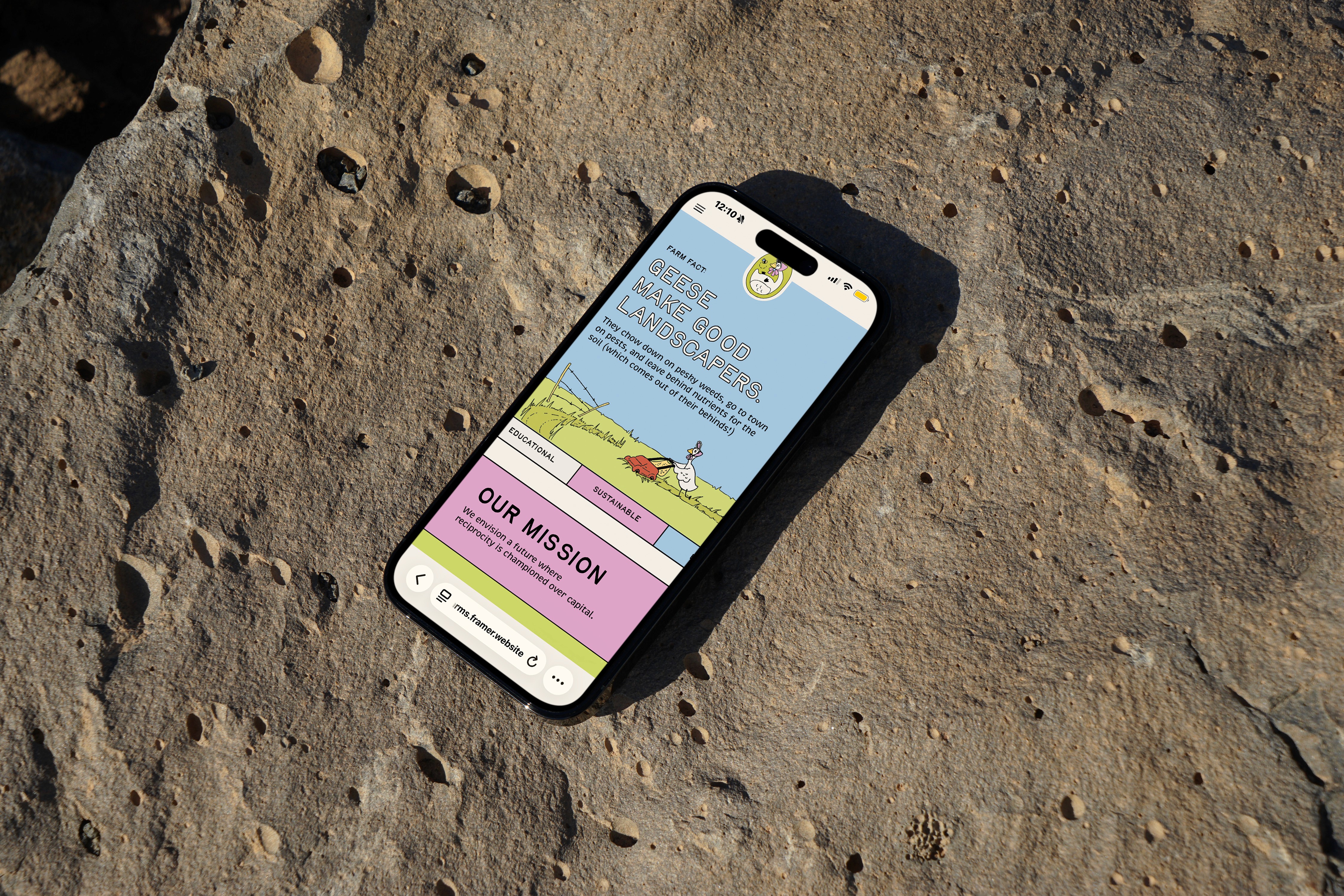
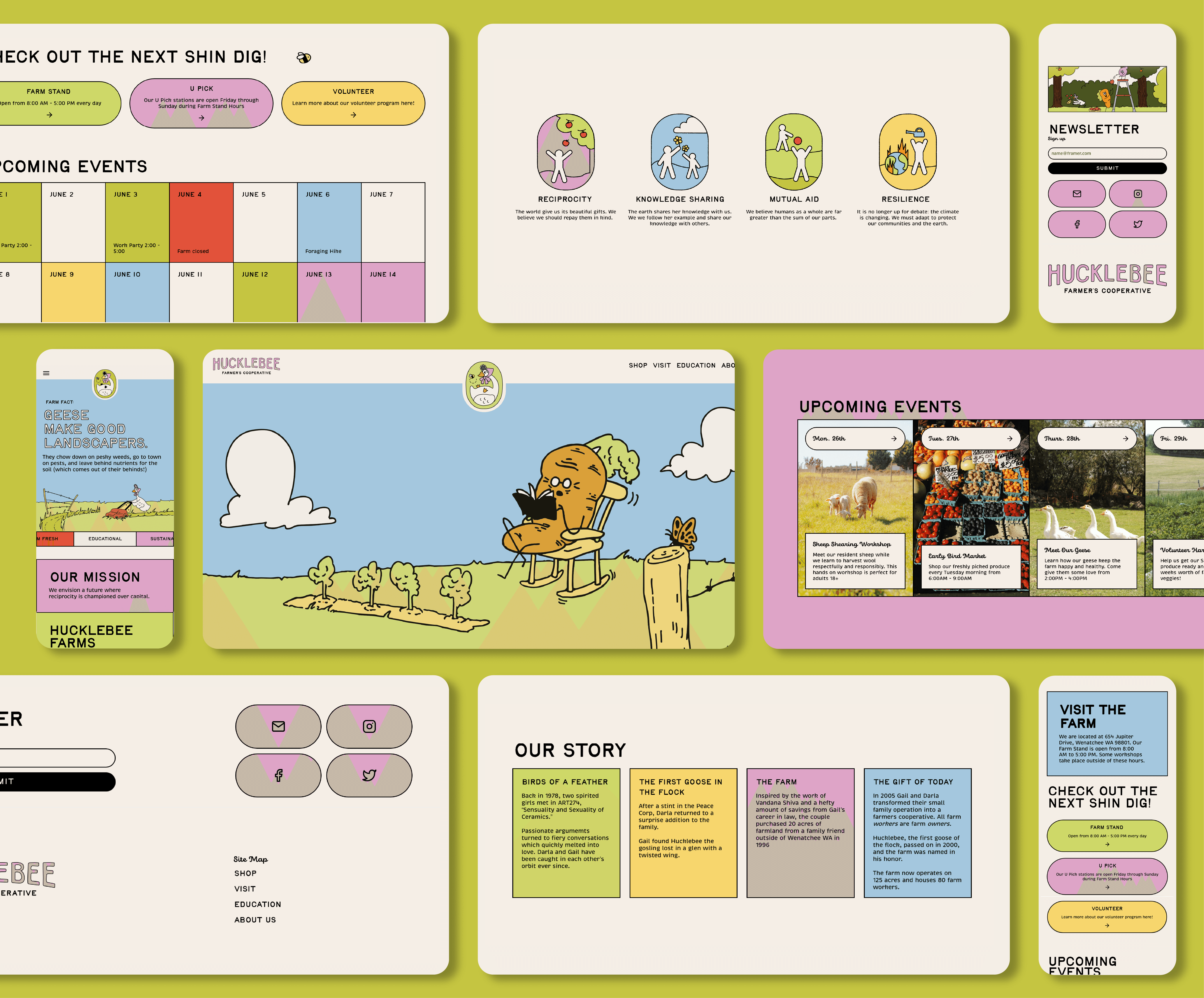
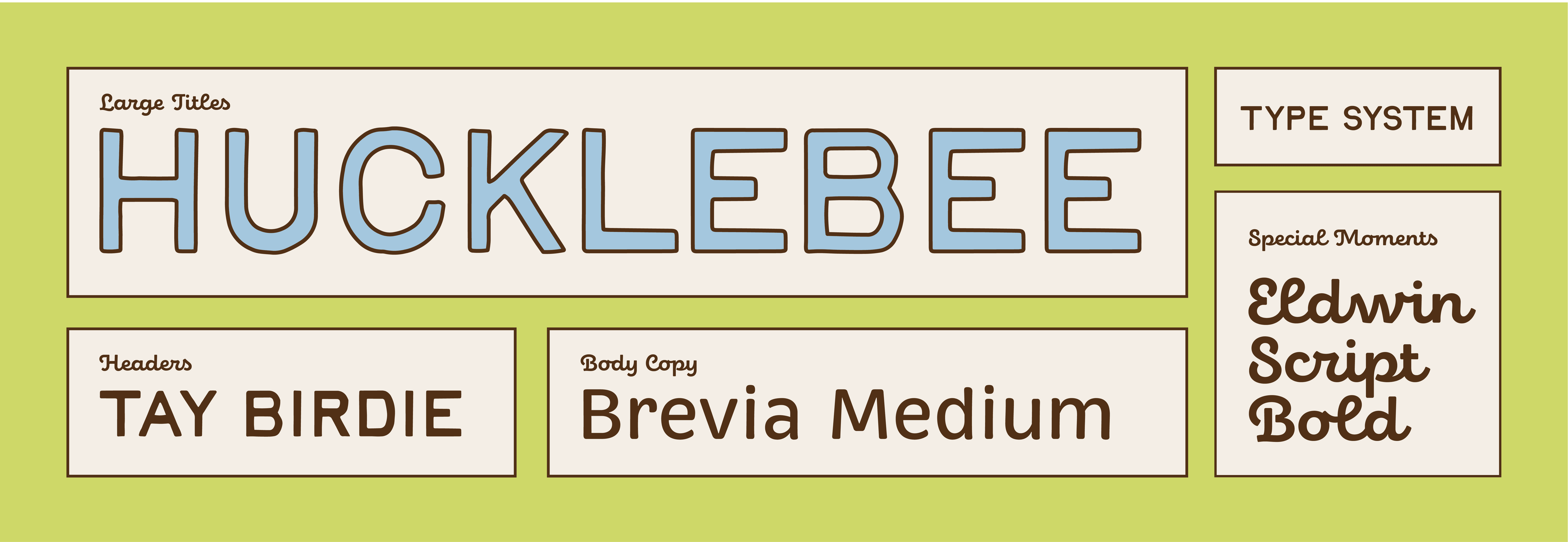
We were tasked with developing a visual system that would represent Hucklebee’s meaningful mission as well as their playful culture.


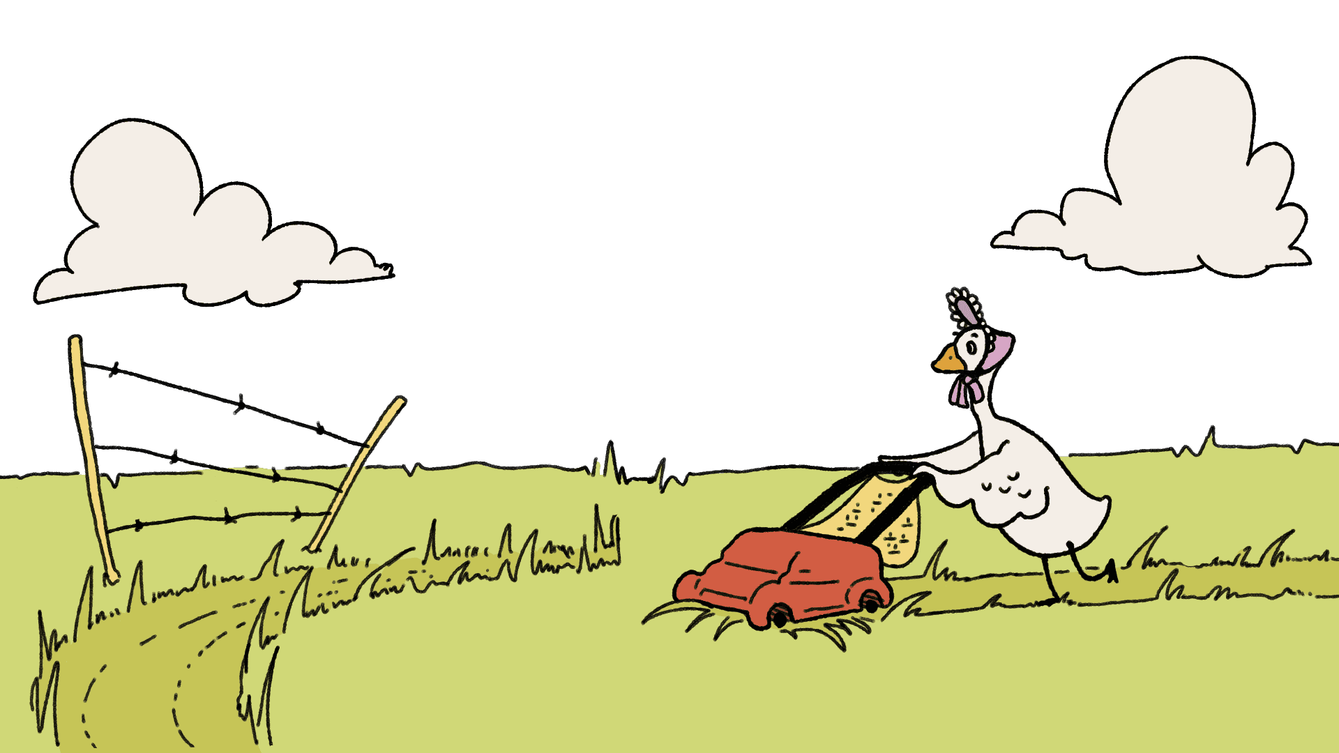
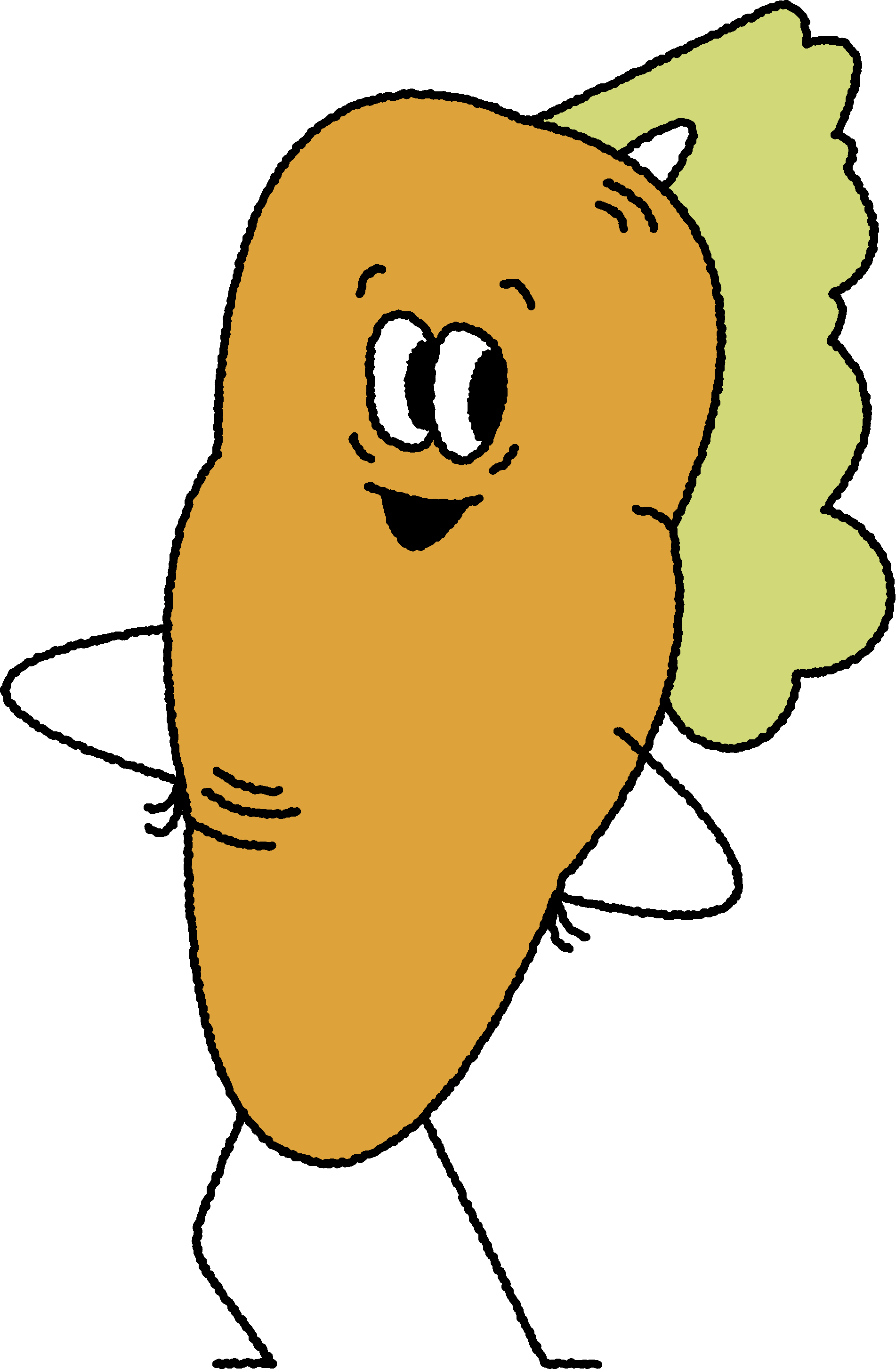
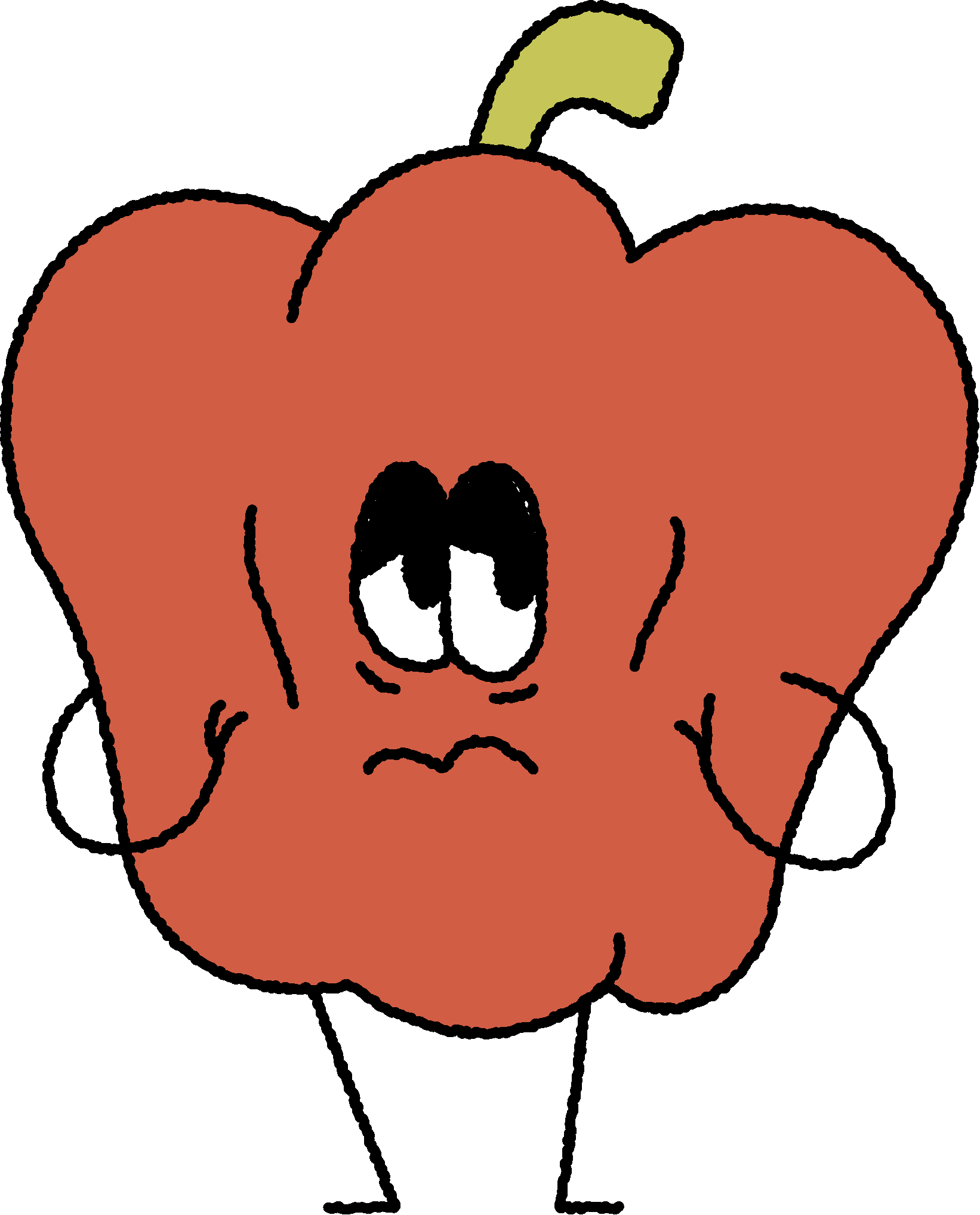
Hucklebee is a co-operative dedicated to community and collaboration. We wanted our illustrations to reflect these sentiments through a family of characters, all connected through one expressive style capable of being integrated into all aspects of the brand.
During this project, my abilities as an efficient illustrator were definitely put to the test. Navigating communication, deadlines, and the several disciplines my illustrations were being used for such as packaging, motion, and web, was a reminder of how important these skills are when working in a team with so many moving parts.


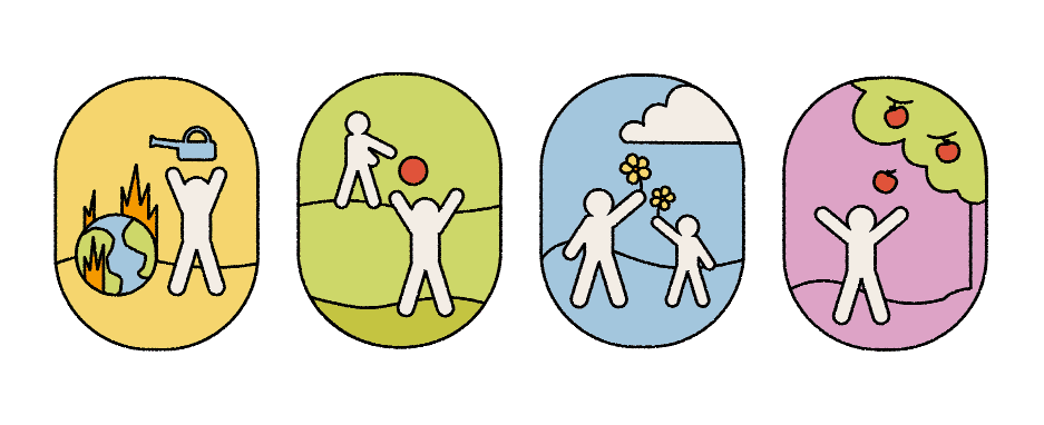

Much of the illustration library that I created needed to be flexible and easy to manipulate for our extensive brand system.
A majority of the time spent on my share of this project started long before I jumped into Illustrator. It was important to me that communication between my team members was as smooth and efficient as possible. This meant creating channels of communication that made sharing files, ideas, and requests as easy as possible, as well as doing check-ins often to ensure we were all still working towards the same goal.

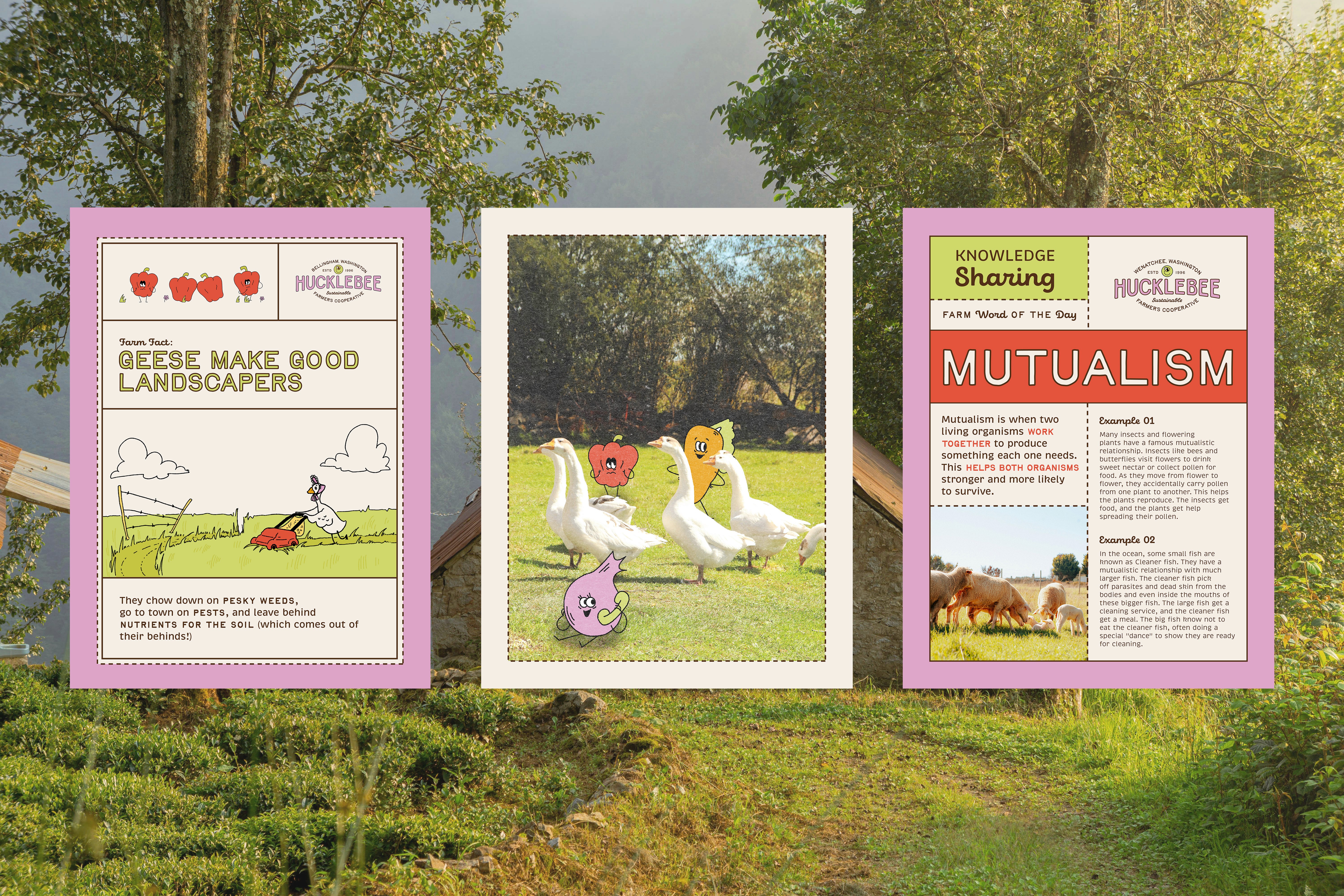
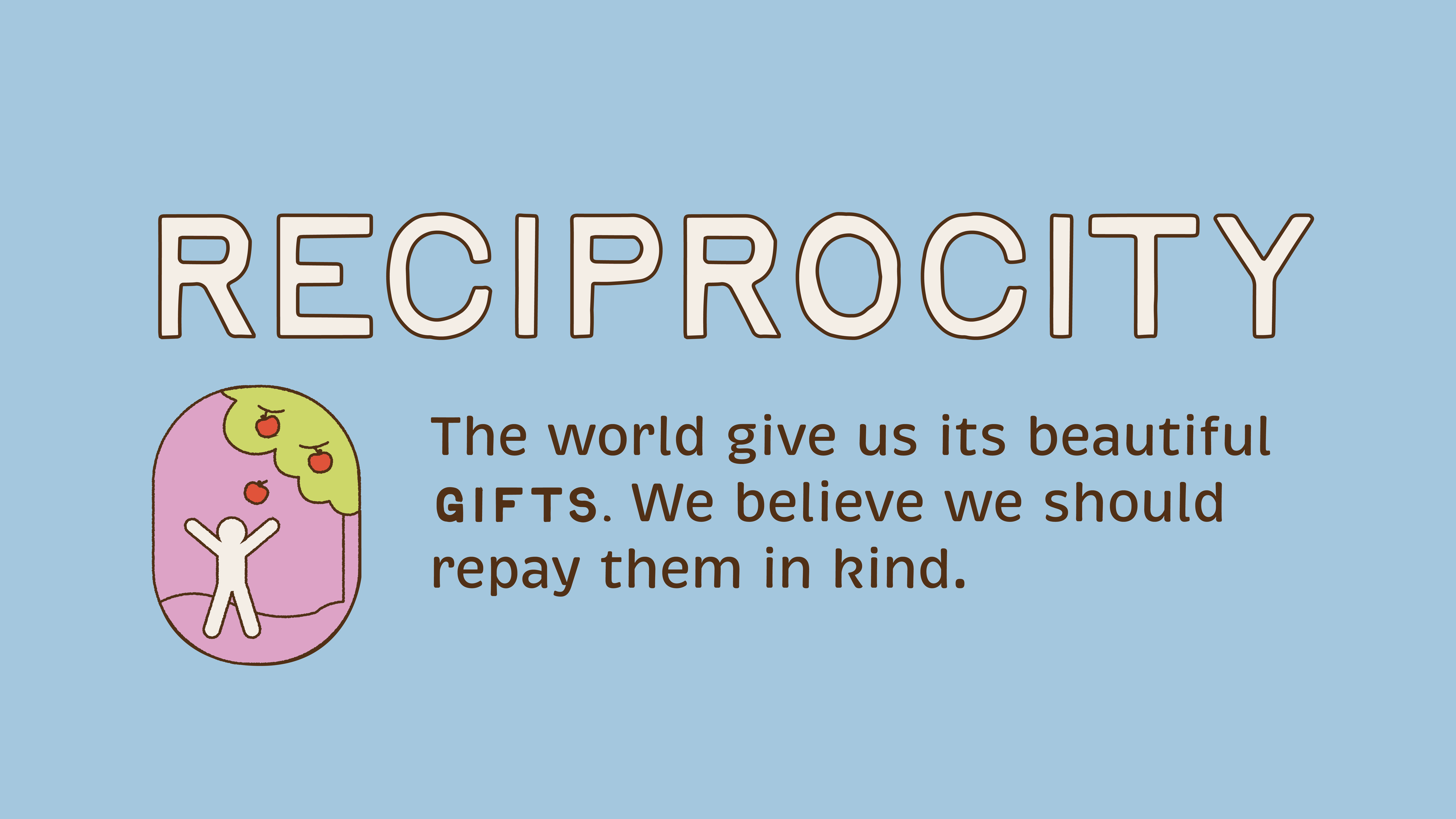
My illustration style for this project was largely based on nostalgic, educational shows like Schoolhouse Rock and The Magic School Bus. We wanted our library of characters to feel welcoming and community oriented, as well as maintain a timeless aesthetic that most generations can connect with.
Throughout this month-long process, I had the pleasure of exploring this direction creatively along with my team members. I am incredibly grateful for the work they have put into this project, and the outcome we achieved.